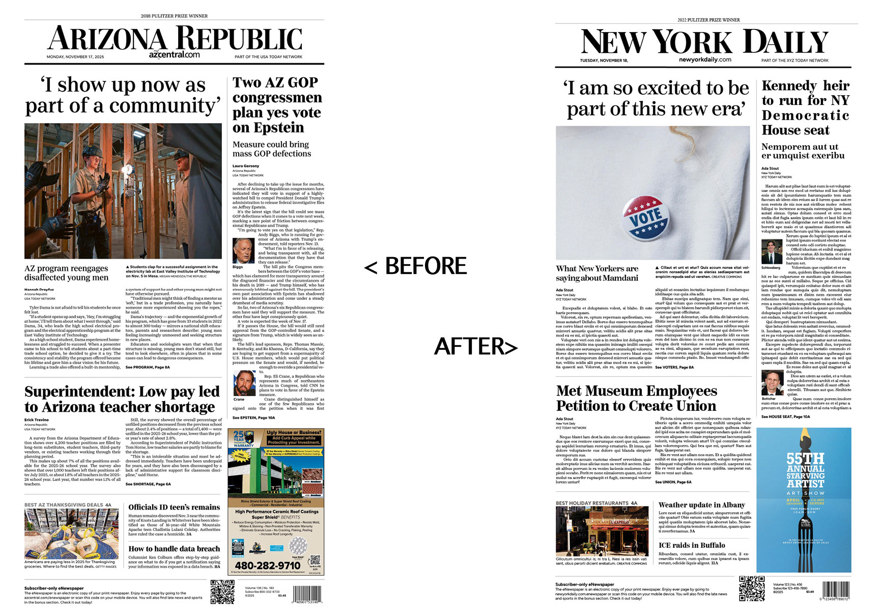
For this assignment, I recreated a newspaper front page in Adobe InDesign, focusing on matching the original layout with precision. The process pushed me to work more meticulously than I ever had in the software; every typographic detail, alignment choice, and spacing decision had a noticeable impact when compared side-by-side with the source. One of the biggest challenges was identifying and replicating the typefaces. Adjusting kerning, tracking, leading, and text frames became a domino effect of refinements that deepened my understanding of grids and visual hierarchy.
Despite the technical hurdles, the project was incredibly rewarding. Sourcing new images and writing fresh headlines allowed me to bring creativity into a rigid structure, and watching the clone come together highlighted how much precision shapes the clarity and readability of print design. By the end, I gained a stronger appreciation for the craft behind newspaper production and more confidence navigating InDesign’s typographic tools. The final result closely mirrored the original front page and reinforced the value of consistency, accuracy, and thoughtful visual organization.