
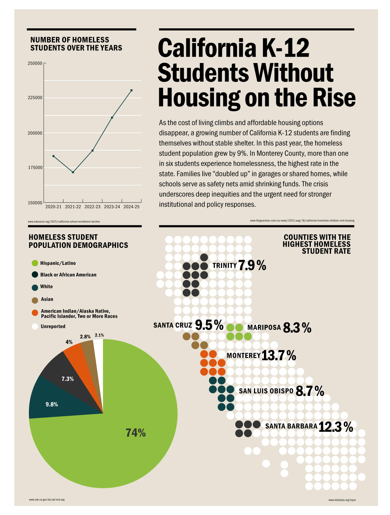
For this project, I focused on building a cohesive visual identity through color, composition, and data visualization. I selected a complementary palette, using slightly muted tones to create contrast without overwhelming the viewer. To represent geographic data, I designed a dot-based map of California, drawing on the Gestalt principle of proximity to create clarity and unity. I paired the map with a pie chart and a line graph to highlight key insights about demographic breakdowns and population changes over time, supported by a brief narrative that frames the story.
I approached the layout by dividing the page into vertical thirds, experimenting with the placement of the headline and graphics to achieve better visual balance. Positioning the title and map on the right side created a more natural flow between the contextual text, the data visualizations, and the geographic reference point. The final composition allows the eye to move intentionally through the information, while the vector-based graphics and unified color system reinforce a clear, accessible presentation of the issue.