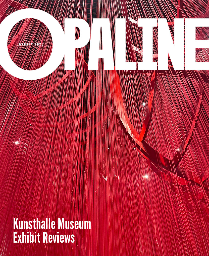
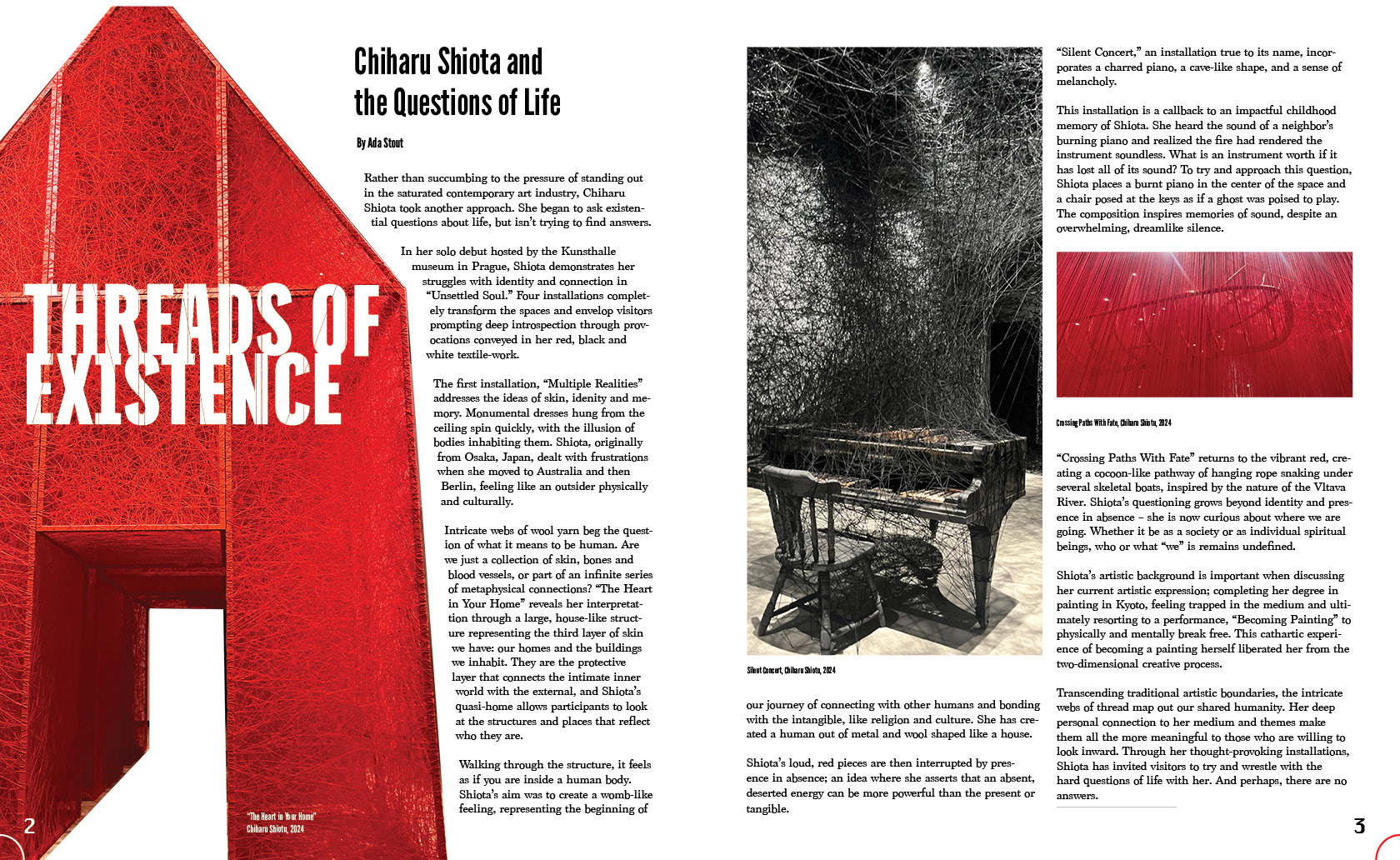
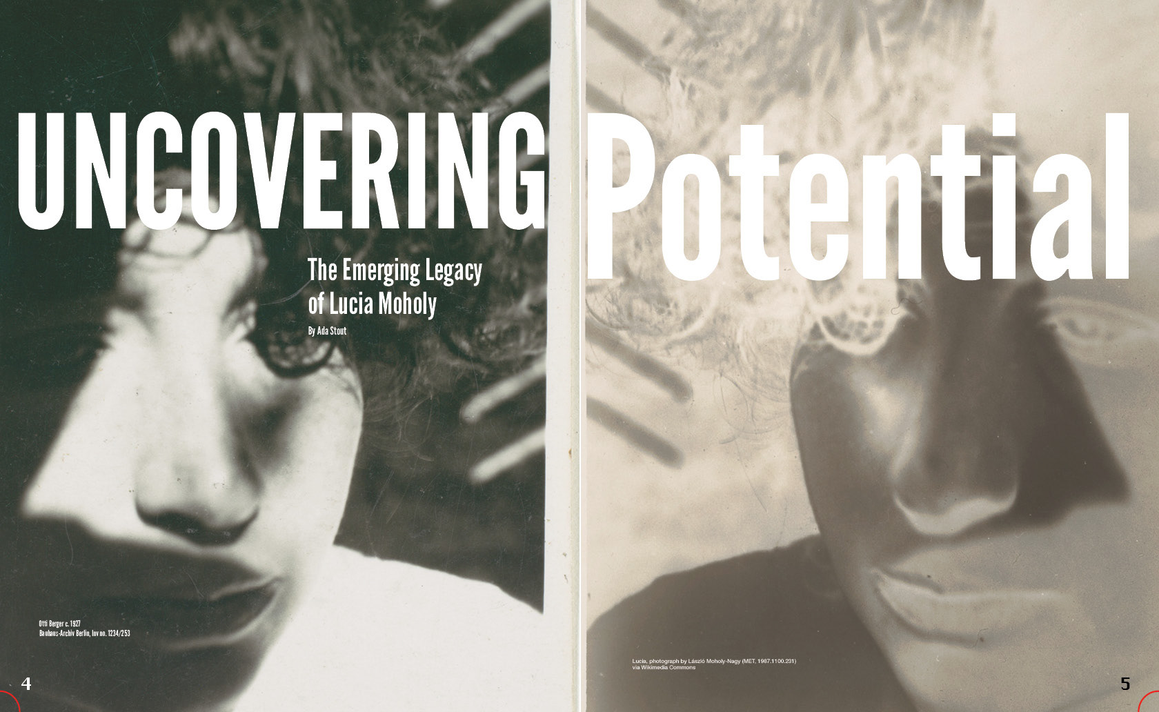
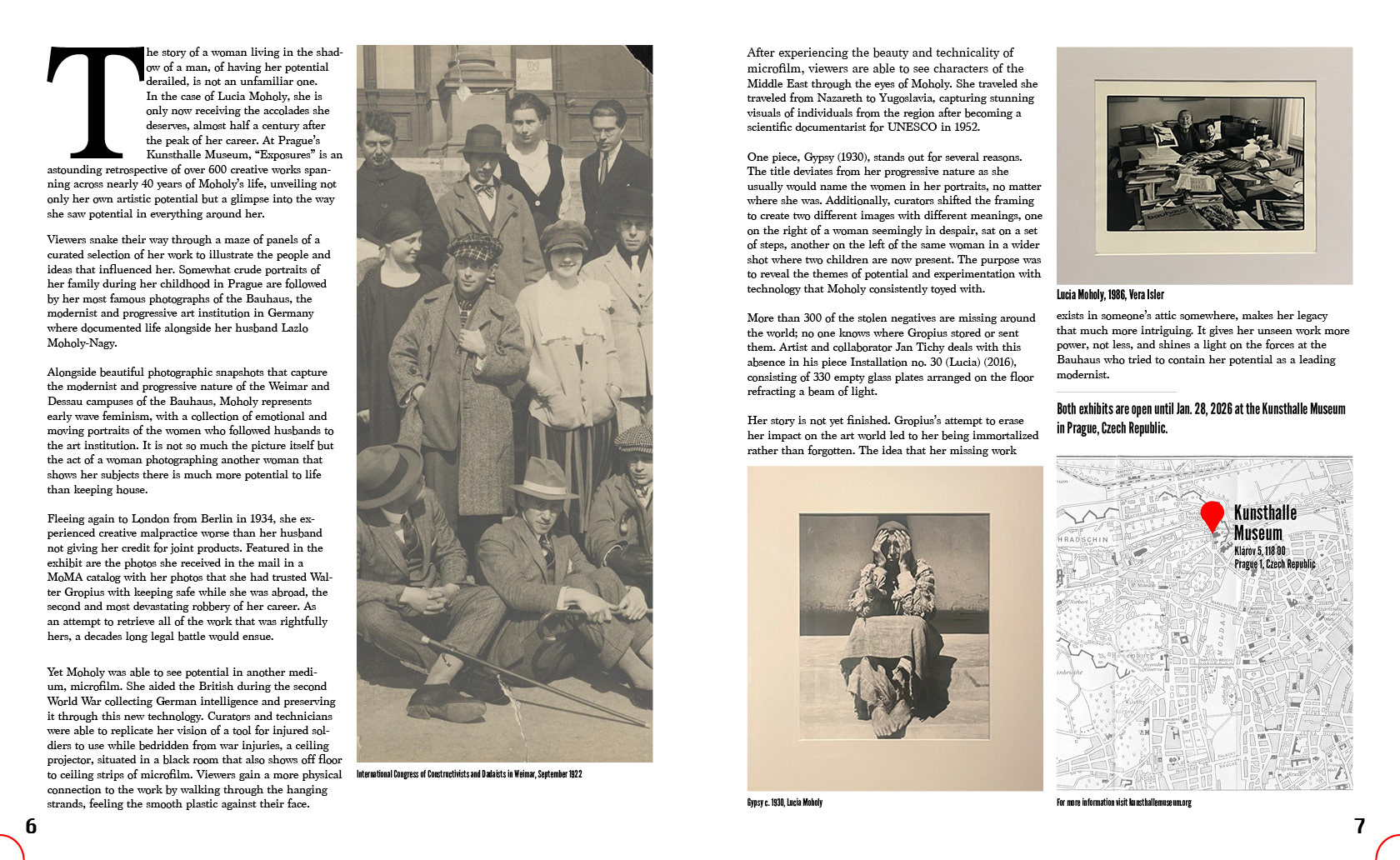
Opaline Magazine
A publication-ready magazine spread reviewing two Prague art exhibitions, merging my journalistic background with visual design. I let the artwork drive the creative decisions of color, tone and structure. I built supporting elements like a custom wordmark and an original map infographic to round out the editorial identity.
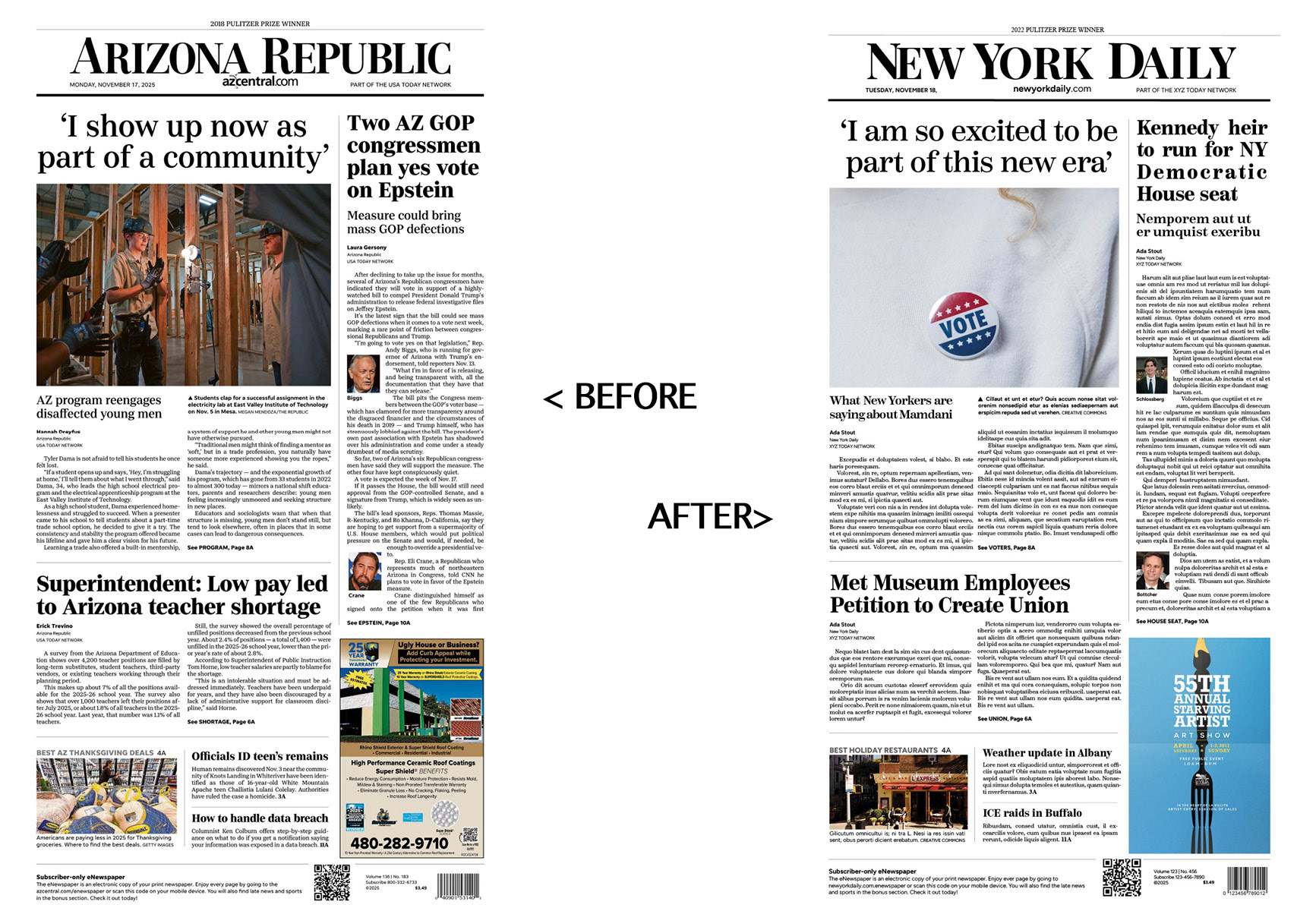
Newspaper Layout Replication
A meticulous recreation of a newspaper front page, challenging me to reverse-engineer the structure and style of professional print design. Beyond replicating the layout, I sourced new photography and wrote original headlines, balancing strict accuracy with creative contribution. The project sharpened my eye for detail and gave me a stronger appreciation for what makes print design clear and readable.